The role of Ayurvedic medicine in interior design
- Mar 13, 2021
- 2 min read


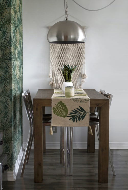
With a year of COVID under our belts and an major increase in the amount of time spent at home, I have realized, more than ever that my mood and overall well-being is a direct reflection of my surroundings. As a result, I have begun to incorporate a holistic approach to interior design that places a focus on supporting wellness of the body, mind and spirit.
One approach I have been using is that of Ayurvedic medicine. You might wonder what this is and how it could be linked to interior design. Ayurvedic medicine is an ancient practice aimed at harnessing the mind-body relationship to heal. There are three doshas or functional body types associated with Ayurveda. Ayurveda has many health benefits, but I have been applying this approach to help choose colors that will create a harmonious environment for my family and myself. Once you determine your dosha, you can begin to experiment with colors and find your perfect palette.
As noted in the photos above, I am obviously drawn to white. I first chose this hue because it was trending and I saw it over and over in design magazines, but I am attracted to this tone because it is calming, yet energizing for me. I now realize there is more to choosing colors than following design trends.
As an example for matching colors with Doshas, here's how I pick colors for my home. I am a mix between Vata and Pitta, Dosha Pitta has an inclination toward warmth, so it prefers cold, mild and pale colors. Bright and intense colors should be excluded, especially red in order to not overload the Pitta "fire". Pitta is dominated by fire energy so light blue colors can calm down the Pitta type.
Dosha Vata prefers energetic and warm colors like white, red, orange or yellow.
The best colors to use are pale and soft, in order to avoid mind stimulation. Vata has a cold and hyperactive nature and is not predisposed to bright and vibrant colors; therefore, pastels are the best choice, while black, brown and grey should be avoided since they inhibit the Vata type.
Finally, for those who identify with Dosha Kapha, it is characterized by heaviness and should stick to energizing and warm colors. They should avoid colors like black, blue, grey and white. Kapha "heaviness" can be stimulated through bright colors like red, gold, yellow and purple, with red being the best color for Kapha, as it stimulates and harmonizes this Dosha.
For more details on each color to help you make the most balanced choice, check out the chart below:

Since my whole family does not identify with the same Dosha, I try to balance colors out as much as possible. One way I have done this for my three kids is by using appropriate colors for their Dosha in their bedrooms. It isn't perfect, and the kids do have toys and clutter that counter the whole "calm environment". My solution for that is to just close their doors ;)
This is only one aspect of holistic interior design, so I use other elements to help create a balanced and harmonious environment. Stay tuned for more more holistic interior design ideas and tips to come.
Thanks for reading!


Comments